
Keep printed can colors consistent across repeat orders by preserving an identified production reference and comparing each new batch against it under the same viewing and measurement conditions. Check that the metal background, white layer and finish still represent the intended decoration before changing the artwork or asking for an ink adjustment.
When a reorder looks different, the immediate question is what changed: the printed can, the reference or the comparison. A repeat-order color comparison record makes that question specific. It helps a beverage brand or filling plant describe a persistent difference without relying on memory, unmatched instrument readings or photographs alone.
Use one identified target for repeat orders, together with its decoration construction and matched comparison conditions. An unchanged design file is useful evidence of design continuity, but it does not describe every physical feature that affects the finished can's appearance.
This approach does not promise zero variation between manufacturing runs. Its purpose is to keep the intended target stable and make a difference interpretable. A changed comparison method should not quietly redefine what an acceptable repeat order looks like.
A repeat-order reference should be a specific physical can or agreed reference set, supported by records that identify what it represents. Record the design name, artwork revision, can format, relevant production lot and date. If the supplier and buyer hold separate reference sets, identify their relationship so both teams know they are comparing against the same intended appearance.
Use an accepted production reference when the aim is to reproduce production appearance. Protect it from handling damage and record its condition before comparison. Keep a working comparison sample where practical, while preserving the identified master. If a retained can is scratched, dirty or visibly altered, disclose that condition rather than treating the affected area as an unquestioned target.
A proof has a different identity and purpose. Sun Chemical's metal-packaging guidance describes digital proofs that emulate the metal substrate for color and design targets. That is an industry proofing example, not evidence that a proof and a production can were made by the same process. State whether a reference is a production can, digital proof or another sample type.
Keep the reference across successive reorders instead of automatically replacing it with whichever batch arrived most recently. Otherwise, small successive changes can become the new comparison point without anyone checking the original target. When a design or appearance change is intentional, identify the new reference and its effective revision explicitly; keep the earlier record available to explain the transition.
Reference identity also includes the physical format. A flat proof and a curved can may serve different comparison purposes. When discussing a retained sample, identify the relevant Baixi Cans aluminum can formats.
Printed can appearance depends on more than the artwork color name. Identify whether the colored area uses a visible metallic background, a white ink underlayer or a white base coating, and record the specified finish. These are different construction details. Ask the decorator which applies rather than treating every white-looking layer as the same material or process.
For example, PPG's external can-coating range describes white base coatings that mask metallic sheen, alongside finishes with gloss, matte, satin and other visual effects. The products illustrate why background opacity and finish belong in an appearance comparison. They do not identify which coating supplier or product is used for a particular Baixi order.
If a repeat can shows more metal through an area that previously appeared opaque, record the observation and ask whether the white construction or coverage changed. Do not assume that making the colored ink darker will reproduce the original appearance. The visible metal and the overlying decoration interact with light, so changing the wrong variable can create a different result rather than restore the intended one.
Similarly, separate a hue difference from an apparent gloss or texture difference. Compare the same printed area while turning both cans through the same viewing arrangement. Record whether the difference is present in the color area generally or mainly in reflections. This observation helps direct the technical discussion; it does not by itself identify an ink, varnish or production fault.
Document the declared finish and any known decoration change with the reorder. An intentional move from gloss to matte calls for a clearly identified appearance target, even if the design file is unchanged. Treat it as a changed construction rather than an unexplained repeat-batch mismatch.
Supplier-system documents serve another purpose. Verify the applicable certificate holder, production site, scope and validity separately from decorative appearance, using Baixi certificate and document guidance.
Compare the physical reference and repeat can side by side under the defined viewing light, with a consistent background and arrangement. Identify the light source or booth setting used. “Office light” and “daylight” are descriptions of locations or impressions, not a sufficiently specific record of the conditions used by two different teams.
Datacolor's lighting guidance explains metamerism: two samples match under one light source but no longer match under another. It also notes that color temperature alone does not fully describe a source's spectral output. Two lamps with a similar warm or cool appearance need not create the same color comparison.
Use the agreed primary viewing condition to make the repeat-order comparison. Where retail appearance matters, add an identified secondary light relevant to that selling environment and record its observation separately. A match under the primary source does not answer every question about another light. Equally, a disagreement seen only under a different source should not be described as a primary-condition result.
Keep both cans in the same orientation relative to the observer and light, then move them together if examining reflective effects. Check the corresponding design areas, rather than comparing a solid logo on one can with a gradient on the other. Note visible scratches, dirt or condensation before judging the color at the affected location.
Ask each team to name its actual condition when their descriptions conflict. “Our sample looks bluer” becomes more useful when accompanied by the reference ID, design area and viewing source. A second comparison can then establish whether the difference persists under the same arrangement. If a viewing light has been replaced, record that change before comparing the new observations.
Keep this viewing record with the reorder documents. For adjacent purchasing questions after the comparison is defined, consult the packaging procurement resources.
Instrument readings need an identified method before they can explain a batch difference. Record the instrument model and identity, measurement geometry, aperture, specular mode, illuminant and observer settings, measurement location and sample-positioning arrangement. Keep these details with the readings rather than sending a standalone color-difference number.
A cylindrical sample makes positioning especially relevant. X-Rite's beverage-can measurement guidance describes using a suitable fixture to hold a can at the correct height and angle for consistent measurements. Use a method suited to the actual can and instrument. The example does not establish that Baixi owns that equipment or that every instrument can measure every finished can directly.
Identify a repeatable printed area large enough for the selected aperture and suitable for the measurement purpose. Use the same location on reference and batch cans, and record how it is found. Avoid silently moving between a solid area, halftone, edge or different white background. If the intended area cannot be measured reliably with the available instrument, ask for a suitable method instead of treating an unstable reading as the target.
Measurement modes also answer different questions. Konica Minolta's SCI/SCE explanation distinguishes measurements including specular and diffuse reflectance, called SCI, from those excluding the specular component, called SCE. Specular reflectance is the mirror-like reflection from the surface. Record which mode was used; numbers from different modes are not a matched comparison.
Keep the visual finish observation alongside the numerical result. A useful color reading does not remove the need to examine whether the specified gloss or metallic appearance is present. Ask the technical team which geometry and mode suit the actual decoration and intended criterion rather than declaring one mode universally correct for all cans.
Agree how repeated readings and samples will be reported. Retain the individual sample identities and relevant observations so variation is not hidden inside an unexplained average. If repositioning produces inconsistent readings, resolve the positioning or method question before interpreting a small reported batch difference. When two laboratories use different instruments, compare their actual settings and have the same identified samples rechecked before attributing all disagreement to printing.
Delta E is a calculated numerical color difference between a sample and a reference. Its formula belongs in the record. Datacolor's tolerance guidance explains that different equations can produce different results for the same measured samples and recommends documenting the measurement conditions. A number without its formula and method is incomplete evidence.
Copy the comparison record below for each same-design reorder. Enter the identified master and the actual batch information together with the artwork revision, decoration construction, comparison conditions and observations. Write “not available” against a missing item and name the information needed; do not guess a method or threshold to complete the table.
| Record field | Information to enter |
|---|---|
| Design and batch identity | Design/SKU name, current artwork revision, reference can ID and source lot/date, repeat-order lot/date and the individual cans compared. |
| Reference type and condition | Production can, proof or other reference; intended comparison purpose; visible damage or alteration on each sample. |
| Decoration construction | For reference and batch: can format, exposed-metal areas, specified white layer/coverage and surface finish; identify known changes. |
| Visual comparison | Primary source or booth setting, background, corresponding design area and orientation; record the observed difference and any secondary-light result separately. |
| Instrument and setup | Instrument model/ID, calibration status, geometry, aperture, specular mode, illuminant and observer settings, fixture/orientation and measurement location. |
| Readings and criterion | Reference and batch readings, repeat-reading method, named Delta E equation and the actual agreed limit or comparison requirement; retain supporting data. |
| Unresolved items | Missing reference, unknown setting or unconfirmed construction detail; state the specific question for the supplier or measurement team. |
| Recheck result | Date, samples and matched conditions used; whether the difference remains; identified files, retained samples and next technical question. |
Use the project's agreed criterion; there is no universal Delta E number supplied by this table. If no tolerance or comparison method was agreed, record that gap and clarify it before claiming numerical pass or fail. Keep a specified finish requirement visible even when the color number is within its stated limit.
For an illustrative slim-can reorder, keep the measurement area and construction tied to that actual format. Product details can be discussed using Baixi 250ml slim can information.
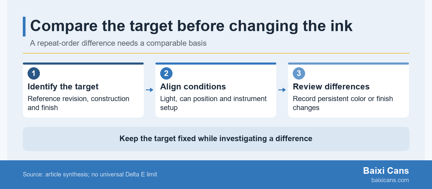
Resolve unmatched comparison conditions first, then investigate a difference that remains. Keep the identified target fixed while investigating; changing the reference to the disputed batch would answer a different question.
Before relying on disputed readings, check the instrument's calibration status and reference condition. Datacolor's calibration guidance warns that dirty, damaged or mismatched calibration tiles can compromise accuracy. Follow the actual instrument maker's procedure; this does not prescribe one calibration interval or cleaning method for every device.
Consider a hypothetical reorder judged against a retained master in office light, while the supplier uses the agreed booth condition. Compare the same pair under the agreed condition first. If the difference disappears there but remains under a relevant retail light, record those as separate observations and investigate the secondary-light requirement. If it persists in the matched comparison, retain that evidence for construction and production review; do not erase it by selecting a more convenient reference.
For a repeat-order discussion with Baixi Cans, send the can specification, artwork revision, identified reference and comparison record. Include total and per-design quantities, printed or unprinted requirement, number of designs, beverage use, destination, project stage and contact details. Ask the team to confirm packaging requirements, available documents, sample arrangements and a quotation, with outstanding appearance questions explicit. To discuss the packaging supply route, review Baixi packaging services.
Reconstruct the intended target with the supplier from identified records and suitable retained samples. State which original evidence is missing. A recent can can be a candidate reference, but calling it the original master would conceal that change. Record the newly established target and its revision explicitly so subsequent reorders have a clear comparison point.
Use photographs to identify the cans and affected area, then resolve color through the agreed physical and measurement comparison. Photographing the pair together can help communicate where to look. Preserve the sample IDs and lighting description with the images, and request a physical recheck when the disputed appearance cannot be established from the available evidence.
Define the intended appearance for each construction before applying one reference or tolerance across both. A result belongs to the identified substrate, white construction, finish and comparison method. If different SKUs are intended to look similar on shelf, make that relationship explicit and establish suitable targets for each construction instead of assuming that a shared artwork color name resolves it.
No. The proofing method and production printing route are separate details. A proof may emulate an intended material while production uses another process. Ask what the supplied proof represents and how it relates to the production reference. An industry digital-proof example does not establish Baixi digital-print equipment, production capability or a different minimum order policy.